Thoughts on Data Visualisation in Sport Science

I have recently been reviewing and reading manuscripts, along with seeing many new sport science related visuals on Twitter/ blog posts, which has led me to a few thoughts… we as sport scientists know how important figures are, to visually communicate data and results in an academic and practical setting. Whilst it is important to create a simple figure, which may summarise a dataset or compare differences between groups, it is also important to ensure we are accurately portraying underlying data, to avoid misrepresentation and assumptions about any descriptive statistics. I think it is particuarly important we strive to do the latter, especially when trying to develop new insights on complex issues. For example, how does an athlete’s output in a daily monitoring test compare to others and/ or themselves? We know that many things may impact an athlete’s performance during a test, including how they are feeling, how motivated they are, how anxious they may be about the training session ahead, how much sleep they have had and, of topical interest, how much training load they physically have completed! Of course, we cannot measure all these things and we certainly cannot communicate them all in a single figure! However, we can gain more insights about our data if we consider the underlying distribution, which is easy to do with so many neat #RStats tools.

Using this hypothetical testing situation and example data, I will take you through how I think we, as sport scientists, can move away from simply presenting aggregate or summary data and instead adding more context/ representation of what is happening in the data we collect on a daily, weekly, monthly or ad hoc basis. First, load required packages then read in the data and take a look at the example structure.
# Load required packages - ensure you have the below installed first, before loading!
library(readxl)
library(tidyverse)
library(viridis)
library(ggridges)
library(gghalves)
# Load "RawData" sheet from example Excel file into R
RawData  <- read_excel("ExampleAthleteData.xlsx", sheet = "RawData")
# Assess the structure of imported data
str(RawData)
## Classes 'tbl_df', 'tbl' and 'data.frame': 249 obs. of 4 variables:
## $ Date : POSIXct, format: "2017-12-04" "2017-12-07" ...
## $ Athlete : chr "Gus Smith" "Gus Smith" "Gus Smith" "Gus Smith" ...
## $ Left Leg Force : num 294 310 349 433 303 474 345 325 358 366 ...
## $ Right Leg Force: num 297 315 360 412 307 457 354 336 395 373 ...Firstly, turn our imported data into a tibble - also known in the tidyverse as a “lazy” data.frame! I will also demonstrate some data cleaning below.
# Create a tibble from our existing object named "Raw Data"
RawData <- as_tibble(RawData)
Then, take a look at the first five rows of data. You can look at more by replacing 5 with 10, 15 or whatever you desire!
Extract, or subset, by a column name and examine the first x entries
# Call out the first five rows of the dataset
head(RawData, 5)
## # A tibble: 5 x 4
## Date Athlete `Left Leg Force` `Right Leg Force`
## <dttm> <chr> <dbl> <dbl>
## 1 2017-12-04 00:00:00 Gus Smith 294 297
## 2 2017-12-07 00:00:00 Gus Smith 310 315
## 3 2017-12-09 00:00:00 Gus Smith 349 360
## 4 2017-12-09 00:00:00 Gus Smith 433 412
## 5 2017-12-11 00:00:00 Gus Smith 303 307Next, rename the columns of the dataset so they are easier to plot.
# Rename columns - make them tidier
colnames(RawData) <- c("Date", "Athlete", "Left", "Right")
We also have here a common “untidy” data problem in sport science whereby one variable (force output of the athlete in N) is spread across multiple (Left and Right) columns. However, we can pivot (using lovely a tidyverse tool) from many columns to instead many rows, and less columns! This is often called going from “wide” to “long” format, whereby instead of data spread across the spreadsheet, we now have data going down the spreadsheet.
# Using the dplyr package, we move from a "wide" to a "long" format
RawData <- RawData %>%
     pivot_longer(c(`Left`, `Right`), names_to = "Leg", values_to = "Force")
# Call out the first five rows of the dataset
head(RawData, 5)
## # A tibble: 5 x 4
## Date Athlete Leg Force
## <dttm> <chr> <chr> <dbl>
## 1 2017-12-04 00:00:00 Gus Smith Left 294
## 2 2017-12-04 00:00:00 Gus Smith Right 297
## 3 2017-12-07 00:00:00 Gus Smith Left 310
## 4 2017-12-07 00:00:00 Gus Smith Right 315
## 5 2017-12-09 00:00:00 Gus Smith Left 349# Make Athlete a factor, as this column contains levels, for ease of later analysis.
RawData$Athlete <- as.factor(RawData$Athlete)
# And then look at the assortment of levels, or athletes, within this column
levels(RawData$Athlete)## [1] "Bobby Lewis" "Dudley Jones" "Gus Smith" "Hudson Lee" "Tom Rivers"# And finally, the number of levels:
# with our example dataset, we can easily count but this is helpful when working with bigger datasets
nlevels(RawData$Athlete)## [1] 5Now the data is in long format, we can calculate summary statistics and start to visualise the data. Let’s start with calculating mean force, for both legs, across the entire group, a common descriptive statistic and visual in sport and exercise science.
# Perform group by analysis - mean force by leg
MeanForceData <- RawData %>%
  group_by(Leg) %>%
  summarise(Mean = mean(Force))
# Show output
MeanForceData
## # A tibble: 2 x 2
## Leg Mean
## <chr> <dbl>
## 1 Left 413.
## 2 Right 422.Plot this data with the ggplot2 package and create a typical figure - a bar plot!
# Plot in ggplot2
ggplot(MeanForceData,
aes(x = Leg, y = Mean)) +
# geom_col makes the heights of the bars represent values in the data
geom_col() +
# I like a theme_classic for simple yet publication worthy figures
theme_classic()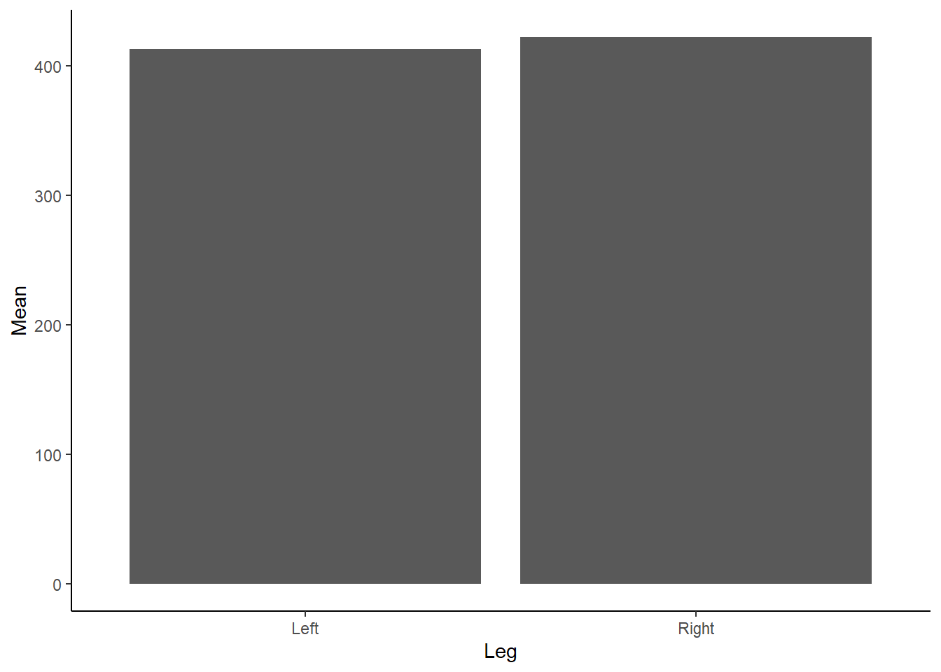 Figure 1: Mean Force (N) according to left or right leg.
Do you see any issues with our above Figure 1? Aside from the need to add a unit (N) for Force on the y-axis and adjust the x-axis so it isn’t floating, as we don’t have any negative force values… bar charts, although extremely popular, are not great at conveying information about the underlying data. Bar charts contain dead space at the bottom of the figure, given we are inherently drawn to the height and comparison between bars. They also are not suitable for continuous data! Tracey Weissgerber has an excellent paper in Plos Biology on moving past bar and line graphs, which steps through the above issues. I also recommend viewing this neat figure from the paper which demonstrates how many different datasets can lead to the same bar graph.
Instead of using bar charts, many researchers instead prefer to present the mean +/- standard deviation (SD). We could add the SD bars to the box plot, although let’s recreate them instead as a line graph. We can do this in dplyr by first calculating the SD:
# Perform group by analysis - mean force by leg
MeanForceData <- RawData %>%
  group_by(Leg) %>%
  summarise(Mean = mean(Force),
            SD = sd(Force))
# Show output
MeanForceData
## # A tibble: 2 x 3
## Leg Mean SD
## <chr> <dbl> <dbl>
## 1 Left 413. 71.8
## 2 Right 422. 68.1Then creating the following visual in ggplot2 by running the following code:
# Plot in ggplot2
ggplot(MeanForceData,
aes(x = Leg, y = Mean)) +
# Add lines
geom_line() +
# Add points
geom_point(size = 5)+
# Add SD bars - by drawing upon our Mean +/- our SD
geom_errorbar(aes(ymin = Mean-SD, ymax = Mean+SD), width = .2,
position = position_dodge(0.05)) +
# Add our simple theme
theme_classic()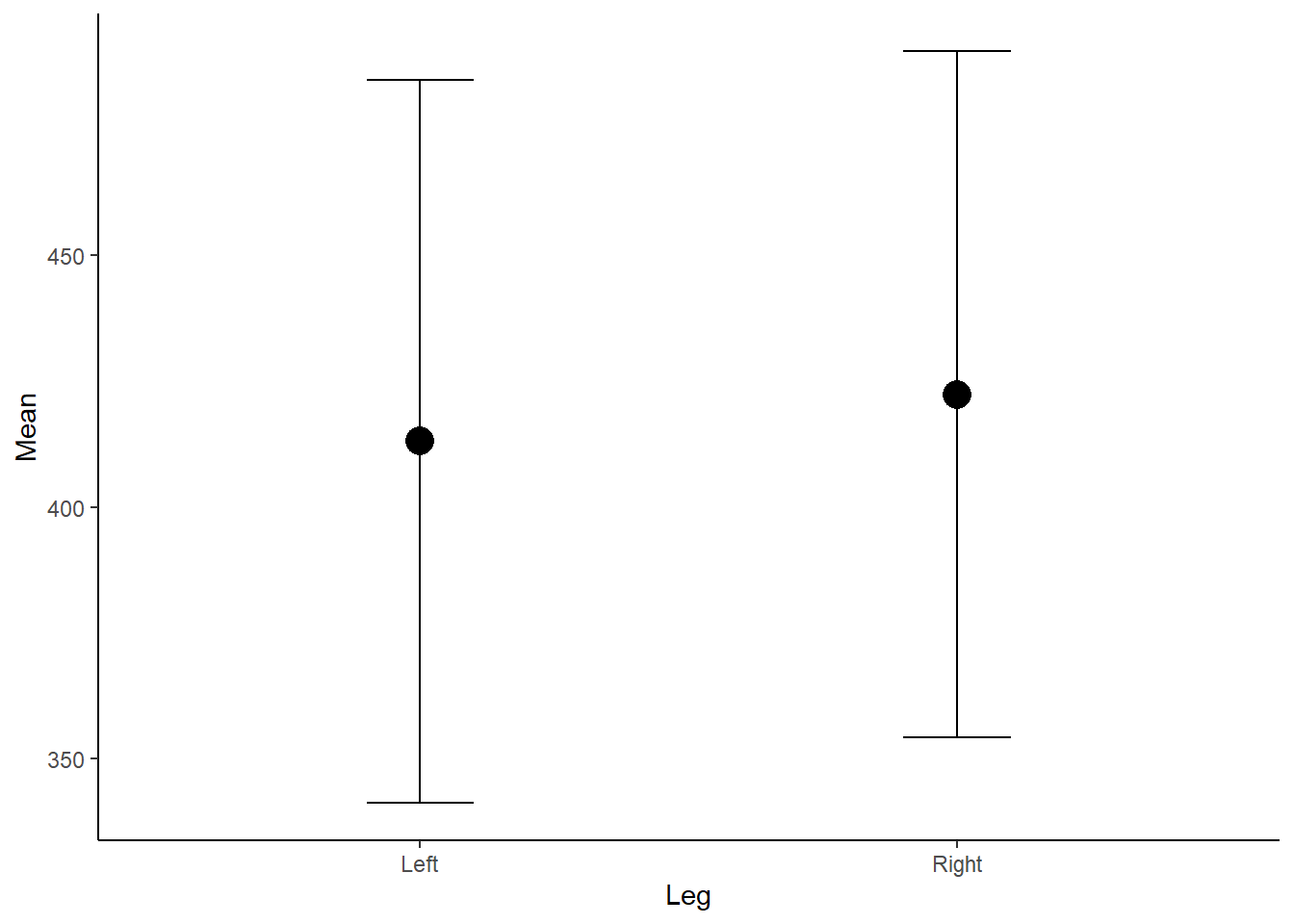 Figure 2: Mean Force (N) according to left or right leg.
Now, the above plot is OK however does not show us anything about the underlying data, the distribution and any outliers. As we know, a mean is also influence by outliers, which we cannot detect in the above figure, and therefore may be misleading if the distribution is skewed. If the data is not normally distributed and non-parametric tests are used, medians should be presented instead of means.
We can visualise this by creating box and whisker plots which display a five-number summary of the data, including our median and interquartile range (IQR) which visualises the range between the 25th and 75th percentile. They are super easy to create in ggplot2.
# Plot in ggplot2 - use our original dataset
ggplot(RawData,
       aes(x = Leg, y = Force)) +
  # Create a boxplot
  geom_boxplot() +
  # Add our simple theme
  theme_classic()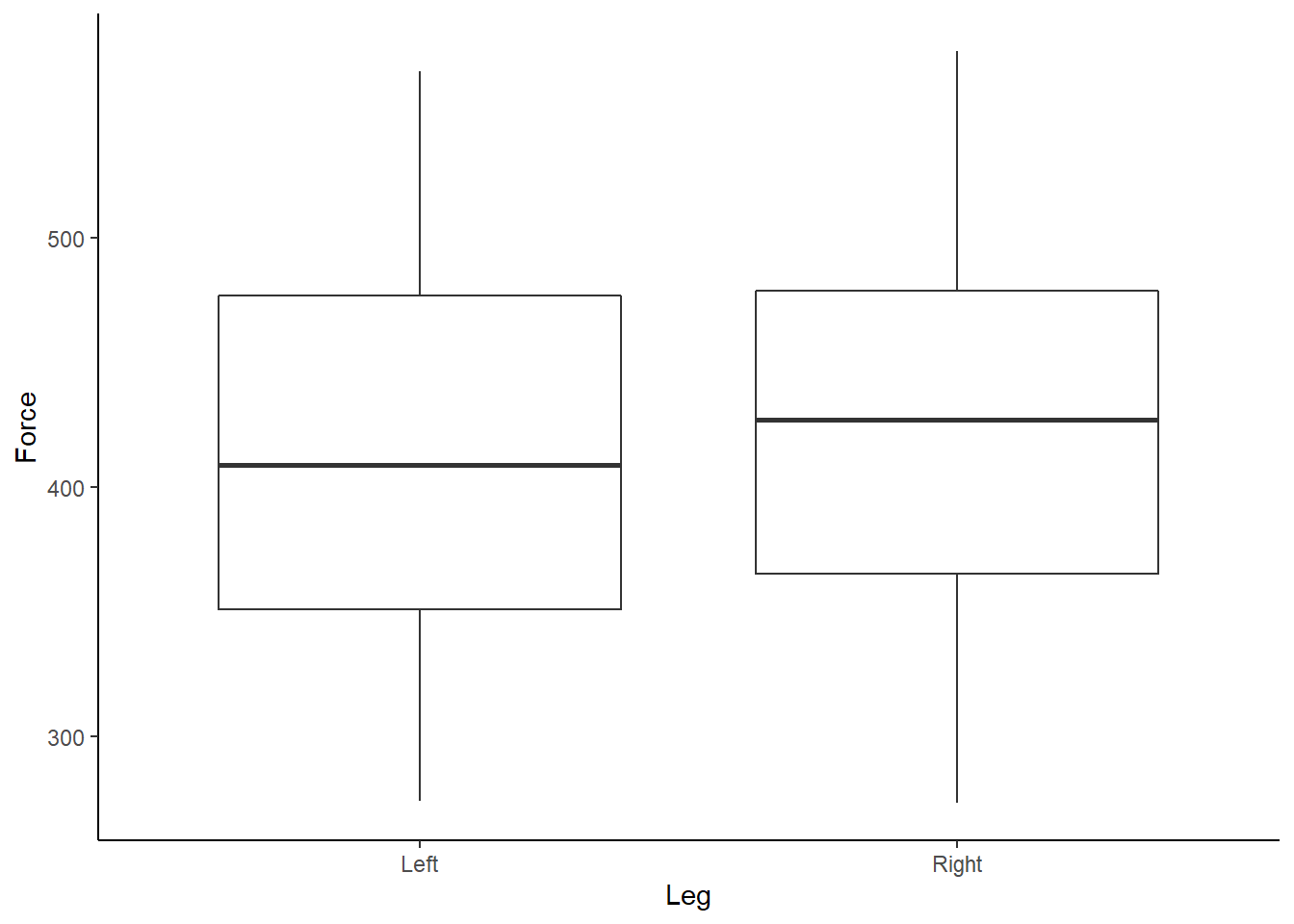
Figure 3: Boxplot of Force (N) according to left or right leg.
Box and whisker plots show us a little more detail about our data, along with identifying outliers. We can also start to look at each athlete’s individual data, and further assess any outliers, by using the facet_wrap function within ggplot2.
# Plot in ggplot2 - use our original dataset
ggplot(RawData,
aes(x = Leg, y = Force)) +
# Create a boxplot
geom_boxplot() +
# Add our simple theme
theme_classic() +
# Here we want to create individual boxplots for each athlete
facet_wrap(~Athlete)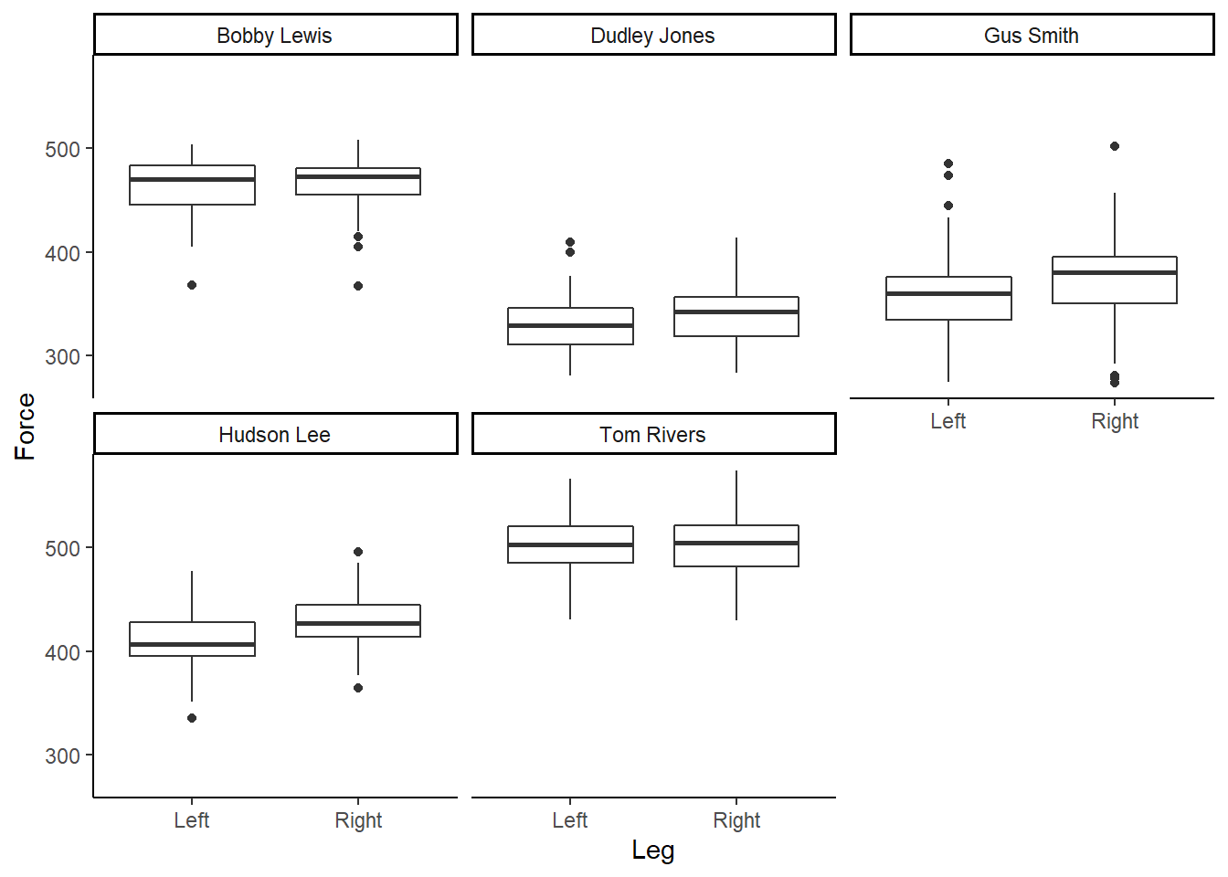 Figure 4: Boxplot of Force (N), per participant, according to left or right leg.
Box and whisker plots are great, however, I like to design my plots how I like my Malteasers - more is always better! Given we have a range of and distribution of numbers, or force values, we should start to visualise this uncertainity when communicating sport science data. Therefore, I am a big wrap of density and violin plots, which help add much more context to your underlying data when accompanied by a boxplot. Thankfully, we can easily do this in ggplot2 by running:
# Plot in ggplot2 - use our original dataset
ggplot(RawData,
aes(x = Leg, y = Force)) +
# Add a violin plot to the mix
geom_violin() +
# Layer a boxplot ontop, scaling the width
geom_boxplot(width = 0.1) +
# Add our simple theme
theme_classic()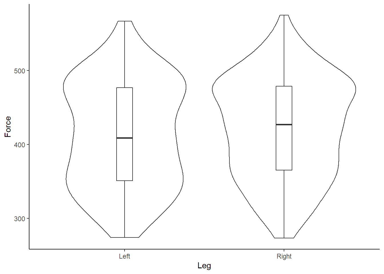 Figure 5: Box and violin plot of Force (N) according to left or right leg.
What do you instantly notice about the example data?
And re-creating for each individual participant…
# Plot in ggplot2 - use our original dataset
ggplot(RawData,
aes(x = Leg, y = Force)) +
# Add a violin plot to the mix
geom_violin() +
# Layer a boxplot ontop, scaling the width
geom_boxplot(width = 0.1) +
# Add our simple theme
theme_classic() +
# Recreate individual box and volin plots for each athlete
facet_wrap(~Athlete)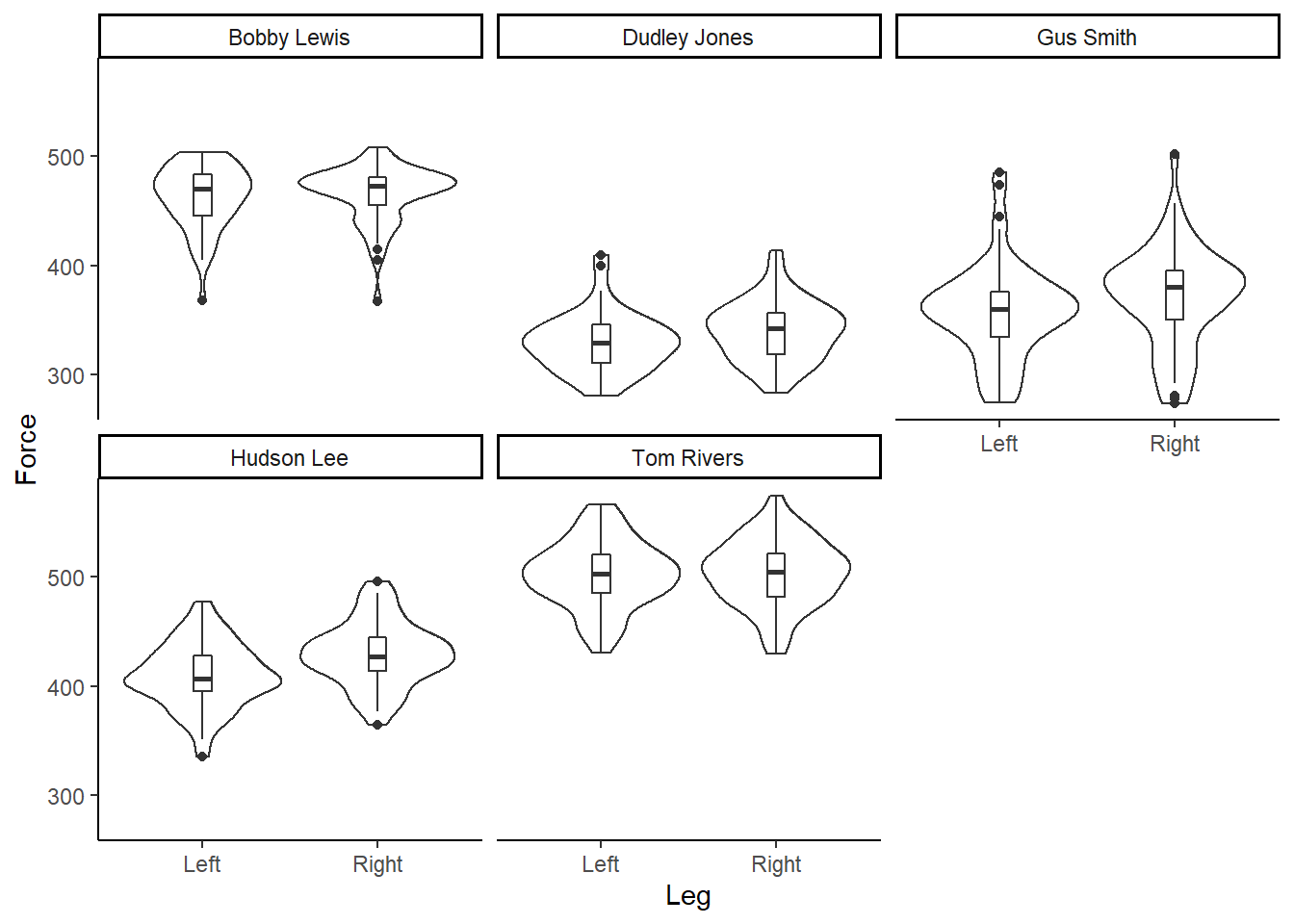 Figure 6: Box and violin plot of Force (N), per participant, according to left or right leg.
Our data is bimodal! And non-normally distributed!
Violin plots are great, as we can now start to visually assess the underlying structure and distribution of the dataset, whilst still identifying outliers and summary statistics. However, I find violin plots a tad overwhelming and a little duplicated, given the distributions are mirrored on either side of the boxplot. Therefore, often the very first plot I will run when looking at a new dataset is a simple density plot. Thanks to ggplot2 this is very simple to run!
# Plot in ggplot2 - use our original dataset
ggplot(RawData,
aes(x = Force,
fill = Leg)) +
# Add a density plot
geom_density() +
# Add our simple theme
theme_classic() 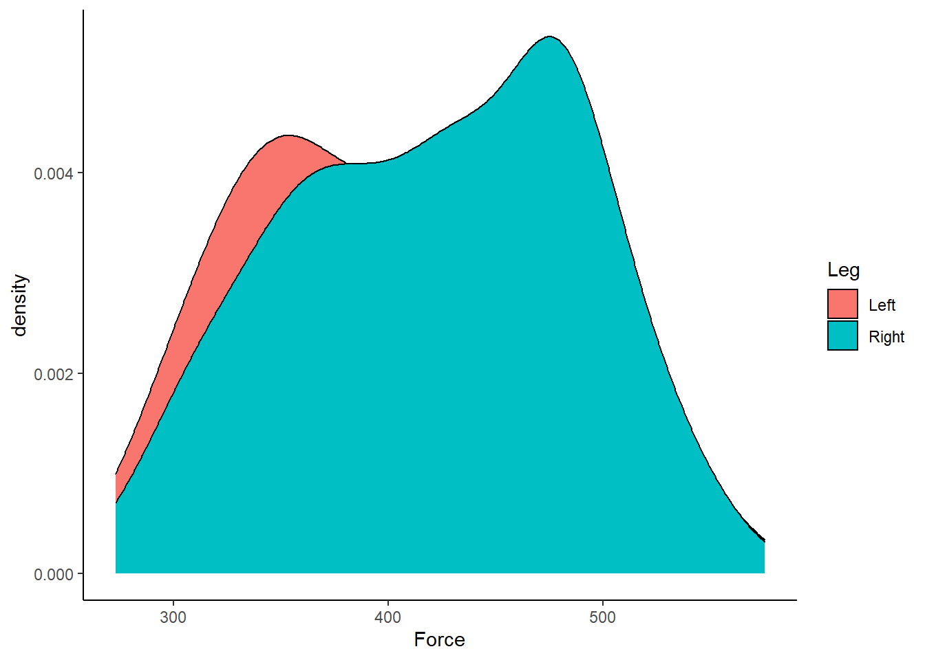 Figure 7: Distribution of Force (N) according to left or right leg.
Straightaway, it is easy to visualise that our dataset is bimodal and non-normal! We can also do a few tweaks in ggplot2 to make a more visually pleasing plot.
# Plot in ggplot2 - use our original dataset
ggplot(RawData, aes(Force, fill = Leg)) +
# Allow the plots to overlap
geom_density(alpha = 0.5) +
# Add a label for the x-axis
xlab("\n Force (N)") +
# Add a call to the viridis palette, to create an accessible plot
scale_fill_viridis(discrete=TRUE) +
# Adjust the scaling of the plot, as we know we don't have any negative values!
# Be careful when using distributions, to ensure you aren't adding tails that are artificial
# Also tails that don't make sense. For example, adding tails so you have negative deaths or height!
scale_y_continuous(expand = c(0, 0)) +
# Make the theme "classic" for ease of interpretation
theme_classic() +
# Move our legend from the RHS of the figure to the bottom
theme(legend.position = "bottom",
# Remove y-axis label
axis.title.y = element_blank())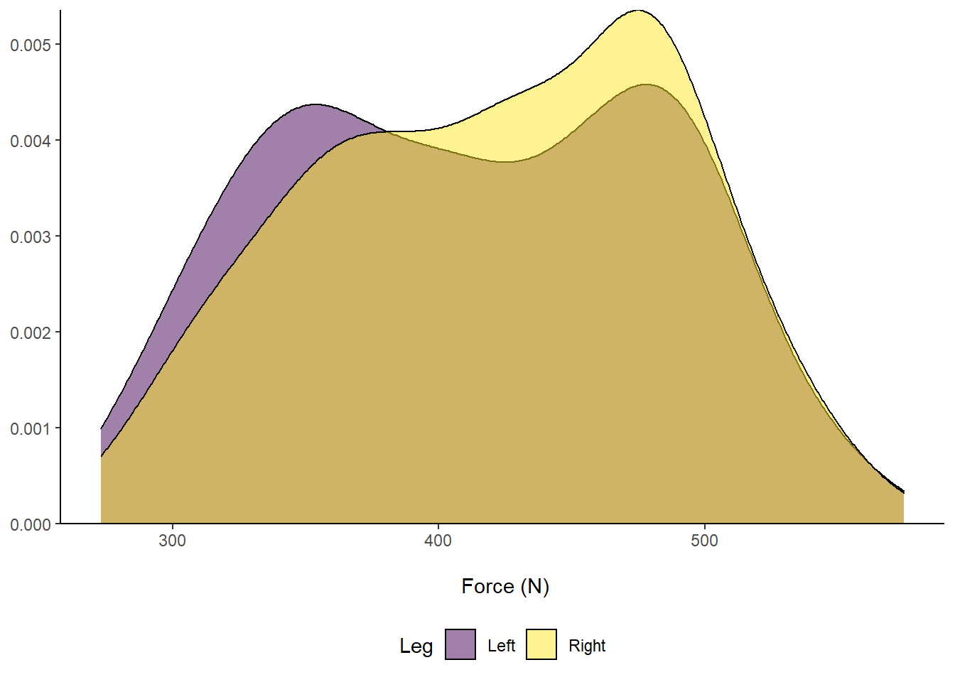 Figure 8: Distribution of Force (N) according to left or right leg.
Another package that I LOVE to use when visualising many distributions, for example rounds of AFL matches or groups of players, is ggridges by Claus Wilke who has an excellent resource on the fundamentals of data visualisation. The ggridges packages is again super easy to use. Let’s take a closer look below:
# Plot in ggplot2 - use our original dataset
ggplot(RawData, aes(x = Force, y = Leg, fill = Leg)) +
# Allow the plots to overlap
geom_density_ridges() +
# Add a label for the x-axis
xlab("\n Force (N)") +
# Add a call to the viridis palette, to create an accessible plot
scale_fill_viridis(discrete=TRUE) +
# Adjust the scaling of the plot, as we know we don't have any negative values!
# Be careful when using distributions, to ensure you aren't adding tails that are artificial
# Also tails that don't make sense. For example, adding tails so you have negative deaths or height!
# Make the theme "classic" for ease of interpretation
theme_classic() +
# Our legend is now redundant, so remove
theme(legend.position = "none",
# Remove y-axis label - it is implied by the text
axis.title.y = element_blank())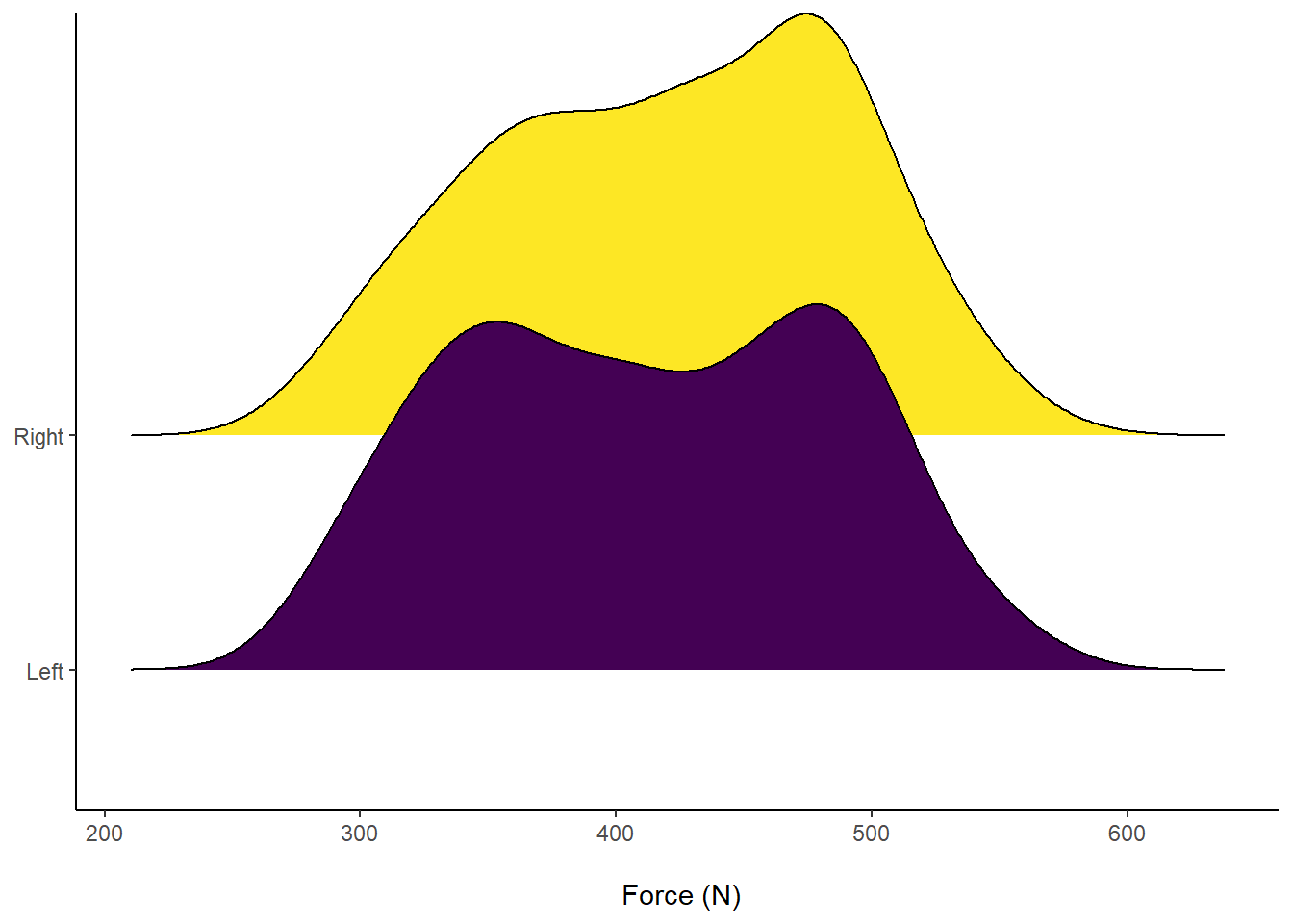 Figure 9: Distribution of Force (N) according to left or right leg.
The cool feature about ggridges is that we can fill the distributions with underlying data points that comprise the distribution. This is super useful to visualise data about an invidiual athlete during a training drill, for example. We can also do this with the above box plots, by adding the functions geom_dotplot() or geom_jitter() instead of our geom_boxplot call. However, I wil stick to showing you individual points within the density plots.
# Plot in ggplot2 - use our original dataset
ggplot(RawData, aes(x = Force, y = Leg, fill = Leg)) +
# Allow the plots to overlap & add in required info for point colour/ shape
geom_density_ridges(
aes(point_shape = Leg),
alpha = .2, point_alpha = 1, jittered_points = TRUE) +
scale_point_color_hue(l = 40) + scale_point_size_continuous(range = c(0.5, 4)) +
scale_discrete_manual(aesthetics = "point_shape", values = c(21, 22)) +
# Add a label for the x-axis
xlab("\n Force (N)") +
# Add a call to the viridis palette, to create an accessible plot
scale_fill_viridis(discrete=TRUE) +
# Make the theme "classic" for ease of interpretation
theme_classic() +
# Our legend is now redundant, so remove
theme(legend.position = "none",
# Remove y-axis label - it is implied by the text
axis.title.y = element_blank())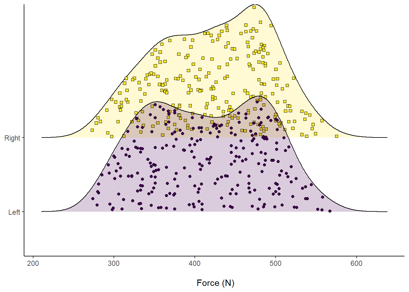 Figure 10: Distribution of Force (N) according to left or right leg, visualising comprising data.
Another cool feature about ggridges is we can overlay accompanying descriptive statistics. For example, visualising the median by splitting into different colours and seeing where they overlap.
# Plot in ggplot2 - use our original dataset
ggplot(RawData, aes(x = Force, y = Leg, fill = factor(stat(quantile)))) +
# Add quantiles = 2 which implies one line for the median
stat_density_ridges(
geom = "density_ridges_gradient", calc_ecdf = TRUE,
quantiles = 2, quantile_lines = TRUE
) +
# Add a label for the x-axis
xlab("\n Force (N)") +
# Add a call to the viridis palette, to create an accessible plot
scale_fill_viridis_d(name = "Quartiles") +
# Make the theme "classic" for ease of interpretation
theme_classic() +
# Our legend is now required, but move to the bottom
theme(legend.position = "bottom",
# Remove y-axis label - it is implied by the text
axis.title.y = element_blank())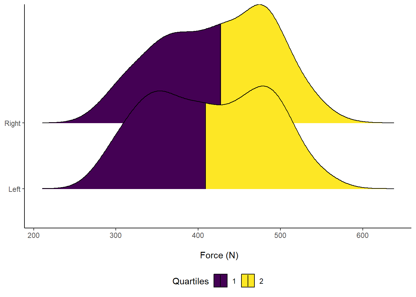 Figure 11: Distribution of Force (N) according to left or right leg. Vertical line indicates Median force.
If you are interested in learning more about data visualisation principles, I highly recommend that you check out Dr. Andrew Heiss’ online course on Data Visualisation. There is course content on visualisaing uncertainity, including this slide deck that includes my new favourite - raincloud plots! Here is an example of how to create a raincloud plot, with a half boxplot, using our example data:
# Plot in ggplot2 - use our original dataset
ggplot(RawData, aes(x = Leg, y = Force, colour = Leg, fill = Leg)) +
# Add points
geom_half_point(side = "l", size = 0.3,
colour = "black") +
# Add a half boxplot
geom_half_boxplot(side = "l", width = 0.5,
alpha = 0.3, nudge = 0.1,
colour = "black") +
# Add a half violin
geom_half_violin(aes(colour = Leg),
side = "r",
colour = "black") +
guides(fill = FALSE, color = FALSE) +
# Add an accessible colour theme
scale_fill_viridis(discrete=TRUE) +
# Add a label for the y-axis
ylab("Force (N) \n") +
# Scale the y-axis, forcing it to start at 200 but end at 600
# You can also force the y-axis to commence at 0
scale_y_continuous(expand = c(0, 0),
limits = c(200, 600)) +
# Scale the x-axis and add "Leg" to the label name
scale_x_discrete(labels=c("Left" = "Left Leg", "Right" = "Right Leg")) +
# Make the theme "classic" for ease of interpretation
theme_classic() +
# Further customise the theme
theme(axis.text.x = element_text(face="bold", color="black", size=14),
axis.text.y = element_text(face="bold", color="black", size=12),
axis.title.x = element_blank(),
axis.title.y = element_text(face="bold", color="black", size=14))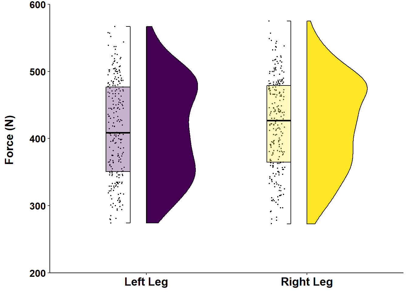 Figure 12: Distribution of Force (N) according to left or right leg.
Thanks for reading this far! Hopefully you have been able to learn something new about visualising sport science data. I have certainly used bar plots to communicate data before, even though I technically should not have. However, over time, I have now learnt how to move past bar and line graphs, learning more about the underlying data distribution - which should not be assume as normal! Please reach out if you have any other tips or questions about how to use ggplot2 to visualise sport science data.
Happy coding in R!